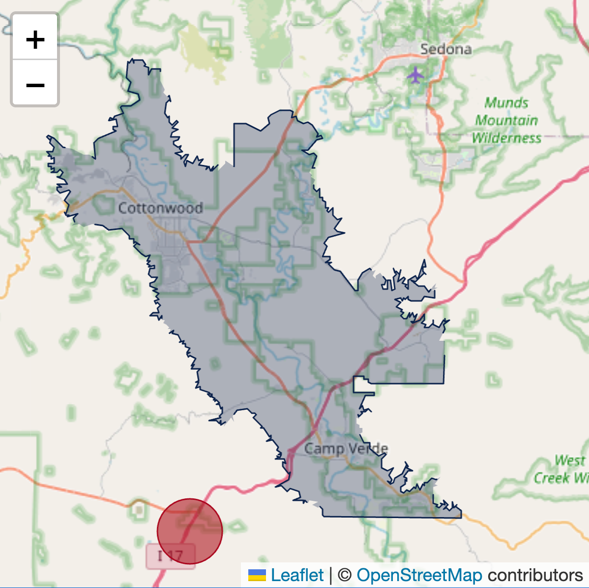
When I started visualizing statewide agricultural data for Arizona, I quickly ran into a familiar problem. I needed to overlay a geographic boundary that matters deeply to growers and winemakers but is mostly invisible on common web maps: American Viticultural Areas. AVAs are legally defined regions, not just rough shapes. Their boundaries follow township and range lines, elevation contours, rivers, and roads pulled directly from federal GIS datasets. That precision is exactly what makes them meaningful, and exactly what makes them tricky to work with on the web.
Most online maps will happily give you counties, states, or ZIP codes, but AVAs are a different story. I was able to find the official written boundary descriptions, the kind that read like “beginning at the intersection of Township X and Range Y, proceeding north along…” but those descriptions are meant for surveyors, not browsers. What I wanted was not just a visual reference line, but a real object on the map with an identity. Something I could attach data to, trigger mouseover events on, and style with CSS the same way I would any other interactive element.
That is where GeoJSON came in.
GeoJSON is a lightweight, text-based format for representing geographic data. At its core, it is just JSON, which means it plays very nicely with JavaScript. A GeoJSON file contains geometry (points, lines, or polygons defined by latitude and longitude coordinates) and properties (metadata you define yourself). Those properties are the key difference between “a line drawn on a map” and “a data object on a map.” An AVA polygon can carry an ID, a name, acreage totals, production statistics, or links to external data, all embedded directly in the geographic feature.
Before working with AVAs, I started with county boundaries. Arizona county GeoJSON files are relatively easy to find online, and they made a perfect first layer. Once loaded, each county polygon becomes a selectable object. You can hover over it, click it, or dynamically change its appearance based on whatever data you bind to it. This same approach works for irrigation districts, school districts, watersheds, soil survey units, or farm parcels. Any place where geography and data intersect, GeoJSON becomes a powerful bridge between the two.
The AVA boundaries themselves came from the Alcohol and Tobacco Tax and Trade Bureau, which publishes them as traditional GIS shapefiles. If you have not encountered them before, shapefiles usually come as a small bundle of files with extensions like .shp, .shx, .prj, and .dbf. Together, they describe geometry, indexing, coordinate systems, and attribute tables. They are excellent for desktop GIS software, but not something a browser can read directly. Rather than rebuilding the boundaries manually, I used a large language model to help convert these shapefiles into GeoJSON. Once converted, they became just another data layer I could upload to my web server and load dynamically with JavaScript.
Calling a GeoJSON file into a web map is refreshingly straightforward. Using OpenStreetMap tiles with a library like Leaflet, you can load the file, assign styles, and attach interaction logic in just a few lines of code:
fetch('/data/arizona_ava_boundaries.geojson')
  .then(response => response.json())
  .then(data => {
    L.geoJSON(data, {
      style: function(feature) {
        return {
          color: '#8b0000',
          weight: 2,
          fillOpacity: 0.15
        };
      },
      onEachFeature: function(feature, layer) {
        layer.on({
          mouseover: () => layer.setStyle({ fillOpacity: 0.35 }),
          mouseout: () => layer.setStyle({ fillOpacity: 0.15 })
        });
        layer.bindTooltip(feature.properties.name);
      }
    }).addTo(map);
  });
Before any GeoJSON layer can exist on a web map, you need a base map to give geographic context. In my case, I used OpenStreetMap, which provides openly licensed map tiles that can be used freely for most public-facing projects. OpenStreetMap tiles give you roads, terrain cues, towns, and landmarks without locking you into a proprietary platform. Conceptually, the base layer is just a raster image grid that sits underneath everything else. Your GeoJSON polygons, lines, and points are then rendered as vector objects on top, which allows them to be interactive, styled dynamically, and tied directly to data.
Using Leaflet, adding OpenStreetMap tiles is usually the very first step after initializing the map itself. Once this base layer is in place, every additional layer you add, counties, AVAs, weather stations, or field boundaries, automatically aligns with it because they share the same coordinate system. A minimal example looks like this:
// Initialize the map and set the starting view
var map = L.map('map').setView([34.2, -111.7], 7);

// Add OpenStreetMap tiles as the base layer
L.tileLayer('https://{s}.tile.openstreetmap.org/{z}/{x}/{y}.png', {
maxZoom: 19,
attribution: '© OpenStreetMap contributors'
}).addTo(map);
Once this is loaded, you have a fully functional map canvas. From there, your GeoJSON layers simply stack on top of it, inheriting the zoom, pan, and projection behavior automatically. I find it helpful to think of OpenStreetMap as the “context layer” and GeoJSON as the “meaning layer.” The base map helps users orient themselves, while your custom boundaries and data-driven styling explain why those places matter. What makes this approach powerful is not the map itself, but the fact that each boundary is now a programmable object. Styles can be driven by data instead of hard-coded values. A polygon can change color based on production volume, acreage planted, or year-over-year trends. You can highlight an AVA when a user selects it from a dropdown, or fade everything else into the background to focus attention. Because the geometry and data are intertwined, the map becomes an interface rather than an illustration.
Once you start thinking this way, the use cases multiply quickly. You can map climate zones and overlay weather station data. You can visualize pest pressure by region, or show where regulatory boundaries intersect with real-world production challenges. For Extension work, this opens the door to translating complex spatial information into something growers can explore intuitively. Instead of reading boundary descriptions or static PDFs, users can interact with the landscape itself.
Here is a snippet of what GeoJSON looks like:
{
  "type": "FeatureCollection",
  "features": [
    {
      "type": "Feature",
      "properties": {
        "id": "AVA-SONOITA",
        "name": "Sonoita AVA",
        "state": "Arizona",
        "established": 1984
      },
      "geometry": {
        "type": "Polygon",
        "coordinates": [
          [
            [-110.703, 31.732],
            [-110.612, 31.732],
            [-110.612, 31.658],
            [-110.703, 31.658],
            [-110.703, 31.732]
          ]
        ]
      }
    }
  ]
}
I also used these boundaries in Google Colab to create another version of the map overlaid on Google Maps.
