Over the past few weeks, I wrapped up a fairly large project that relied heavily on Chart.js for data visualization. Like many tools I end up using in Extension and applied agriculture work, Chart.js wasn’t something I set out to learn for its own sake. I needed a way to clearly, reliably, and efficiently present data on a public-facing website without adding unnecessary complexity or infrastructure. BTW, I started with Tableau and Google Looker Studio with the intention of using an iframe. After trying to accept too many less-than-ideal aspects, I sought an open-source solution that I could tailor to my needs. That’s how I ended up with Chart.js.
Chart.js turned out to be an excellent fit. It is open-source, lightweight, responsive by default, works beautifully on static sites, and integrates well with custom CSS. I was quickly able to apply styles to make the charts feel like part of the page, rather than a bolt-on widget, which is crucial when the goal is communication.
In this post, I want to walk through what Chart.js is, why I think it is such a strong option for agricultural and Extension-style data work, and how to get started using it with simple CSV data. I will also cover the kinds of visualizations it supports and a few lessons learned from putting it into production.
What Is Chart.js?
Chart.js is a JavaScript library for creating charts using the HTML <canvas> element. It focuses on the most common chart types people actually use and does them well: line charts, bar charts, pie and doughnut charts, scatter plots, radar charts, and a few others.
A few characteristics stand out after integrating it into multiple pages of a website:
- Open source and actively maintained
- Lightweight, especially compared to enterprise visualization platforms
- Responsive by default, resizing automatically for mobile and desktop
- No backend required, making it ideal for static sites
- Highly customizable through configuration objects and CSS
Why Chart.js Works Well for Field to Cloud–Style Projects
Much of my work sits at the intersection of agriculture, education, and applied data science. That means:
- Data sets are often modest in size
- Visualizations need to load quickly, even on rural connections
- Outputs need to be understandable to non-technical audiences
- Long-term maintenance matters
Chart.js aligns well with these constraints. Because it runs entirely in the browser, there is no server-side rendering or database requirement. A simple HTML file, a CSV, and a bit of JavaScript are enough to produce polished, interactive charts.
Basic Architecture: From CSV to Chart
At a high level, the workflow looks like this:
- Store data in a CSV file
- Load the CSV using JavaScript
- Parse the data into arrays
- Pass those arrays into a Chart.js configuration
Here is a simplified example.
1. Include Chart.js
<scriptsrc="https://cdn.jsdelivr.net/npm/chart.js"></script>2. Create a Canvas Element
<canvasid="myChart"></canvas>3. Load and Parse a CSV
fetch('data.csv')
.then(response => response.text())
.then(text => {
constrows = text.trim().split('\n');
constlabels = [];
constvalues = [];

rows.slice(1).forEach(row => {
const [label, value] = row.split(',');
labels.push(label);
values.push(Number(value));
});

buildChart(labels, values);
});
4. Build the Chart
functionbuildChart(labels, values) {
constctx = document.getElementById('myChart');

newChart(ctx, {
type: 'bar',
data: {
labels: labels,
datasets: [{
label: 'Example Dataset',
data: values
}]
},

options: {
responsive: true,
maintainAspectRatio: false
}
});
}
This pattern scales surprisingly well. Once you understand the structure, adding filters, toggles, or multiple datasets becomes a matter of configuration rather than rewriting logic.
Chart Types You Can Use
Chart.js supports a focused but practical set of chart types:
- Line charts for trends over time
- Bar charts (vertical or horizontal) for comparisons
- Stacked bars for composition
- Pie and doughnut charts for proportions
- Scatter plots for relationships between variables
- Radar charts for multi-metric comparisons
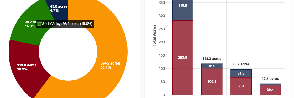
In practice, I find that bar, line, and doughnut charts cover the majority of Extension and agricultural use cases. The key is not variety for its own sake, but choosing charts that match how people intuitively read data.
Styling and CSS Integration
One of the biggest strengths of Chart.js is how easily it integrates with site-wide styling. Fonts, spacing, container widths, and responsiveness are handled through normal CSS rather than locked into a visualization tool’s theme.
This makes it possible to:
- Match charts to an existing brand
- Embed charts seamlessly into long-form content
- Adjust layouts for mobile without rewriting chart logic
For example, placing a chart inside a responsive container:
.chart-container {
max-width: 800px;
height: 400px;
margin: 0auto;
}
This keeps visualizations readable and consistent across devices.
Performance and Latency
Because Chart.js renders directly to the canvas and works entirely client-side, performance is excellent for small to medium datasets. Charts load quickly, feel responsive, and do not require round trips to a server once the page is loaded.
Interactivity and Extensions
Straight away, Chart.js includes:
- Tooltips on hover
- Legends with toggleable datasets
- Animations that help guide attention
With a bit of JavaScript, it is also straightforward to add:
- Dropdown filters
- Checkbox-driven dataset visibility
- Dynamic updates without page reloads
This opens the door to exploratory analysis while still keeping the interface approachable.
When Chart.js Is Not the Right Tool
Chart.js is not meant to handle millions of data points. If you need complex joins, live databases, or heavy analytical transformations, tools like Looker, Tableau, or custom dashboards may be more suitable.
But for quick public-facing reports, Educational materials, Lightweight dashboards, and low-infrastructure sites, Chart.js sits in a sweet spot.
I did not hit this limit with my first project using Chart.js. I plan to test it more thoroughly in the future, now that I have past the learning curve and understand the scope of what I can create. I’ll be able to share the project I built in January when the report is released.